Home and Garden
The Best Paint Colours for a Calm and Relaxing Home
Creating a calm and relaxing home environment is essential for unwinding after a long day. The colours you choose for your walls can significantly influence your mood and the overall atmosphere of your space. This article explores the best paint colours that can transform any room into a serene sanctuary, making it easier for you to relax and feel at peace.
Key Takeaways
- Soft blues and greens are often the most calming colours for any room.
- Neutral shades like whites and beiges can create a soothing backdrop.
- Testing paint samples in different lighting is crucial for finding the right colour.
- Darker shades can also be relaxing when paired with natural light.
- Consider the finish of the paint, as matte finishes tend to be more calming.
1. Water’s Edge
Water’s Edge is a beautiful shade of blue that brings a sense of calm to any room. This colour has a soft, grey undertone that makes it feel soothing and peaceful. Many designers recommend it for spaces where relaxation is key, such as bedrooms or reading nooks.
Why Choose Water’s Edge?
- Calming Effect: The blue hue is reminiscent of tranquil waters, helping to create a serene atmosphere.
- Versatile: It pairs well with various decor styles, from modern to traditional.
- Light Reflective: In a lacquer finish, it reflects light beautifully, enhancing the room’s brightness.
Water’s Edge can transform a space into a peaceful retreat, making it perfect for unwinding after a long day.
Ideal Spaces for Water’s Edge
- Bedrooms: Promotes relaxation and restful sleep.
- Living Rooms: Creates a welcoming and calming environment for guests.
- Home Offices: Helps maintain focus and reduces stress during work hours.
In summary, Water’s Edge is not just a colour; it’s a way to bring a piece of nature into your home, making it a perfect choice for those looking to create a calm and relaxing atmosphere.
2. Alabaster
Alabaster is a wonderful choice for creating a calm atmosphere in your home. This soft, warm white is perfect for those who want a neutral base that feels inviting. It works well in various spaces, from living rooms to bedrooms, making it a versatile option.
Why Choose Alabaster?
- Warmth: Unlike stark whites, Alabaster adds a touch of warmth to your rooms.
- Versatility: It pairs beautifully with both bold and soft colours, allowing for creative layering.
- Calming Effect: The gentle hue promotes relaxation, making it ideal for spaces where you unwind.
Tips for Using Alabaster
- Layer Textures: Combine different materials like wood and fabric to enhance the warmth of Alabaster.
- Accent with Colour: Use vibrant accessories to create a lively contrast against the soft backdrop.
- Consider Lighting: The appearance of Alabaster can change with different lighting, so test it in your space before committing.
Alabaster is not just a paint colour; it’s a way to create a serene environment that feels both modern and timeless.
In summary, Alabaster is a fantastic choice for anyone looking to create a peaceful and inviting home. Its warm undertones and versatility make it a favourite among designers and homeowners alike.
3. Rich Navy
Rich Navy is a stunning colour that can transform any room into a serene retreat. This deep blue hue evokes feelings of calmness and stability, making it an excellent choice for spaces where relaxation is key.
Why Choose Rich Navy?
- Versatile: Works well in various rooms, from bedrooms to living areas.
- Timeless Appeal: A classic colour that never goes out of style.
- Grounding Effect: Creates a sense of security and comfort.
Tips for Using Rich Navy
- Pair with Light Colours: Combine with whites or light greys for a balanced look.
- Use as an Accent: Consider painting one wall to create a focal point without overwhelming the space.
- Accessorise Wisely: Use soft furnishings in lighter shades to soften the overall look.
Rich Navy can be a bold choice, but when used thoughtfully, it can create a peaceful and inviting atmosphere in your home.
Conclusion
Incorporating Rich Navy into your home can provide a calming backdrop that enhances your living space. Whether you choose to paint an entire room or just an accent wall, this colour is sure to impress and soothe.
4. Light Clay
Light Clay is a versatile colour that brings a sense of warmth and calm to any room. This soft, earthy tone creates a soothing atmosphere, making it perfect for spaces where relaxation is key. Here are some reasons why Light Clay is a great choice:
- Warmth: It adds a gentle warmth without being overpowering.
- Versatility: Pairs well with both modern and traditional decor.
- Natural Feel: Reminiscent of natural materials, it helps create a serene environment.
Benefits of Light Clay
| Benefit | Description |
|---|---|
| Calming Atmosphere | Promotes relaxation and peace in your home. |
| Complements Textures | Works beautifully with various textures and fabrics. |
| Timeless Appeal | A classic choice that never goes out of style. |
Light Clay is not just a colour; it’s a way to transform your space into a tranquil retreat. It invites a sense of calm, making it ideal for bedrooms, living rooms, and any area where you seek peace.
Incorporating Light Clay into your home can be as simple as painting an accent wall or using it in your furnishings. This colour is sure to enhance the overall feel of your space, making it a favourite among designers and homeowners alike. Consider adding Light Clay to your palette for a refreshing change!
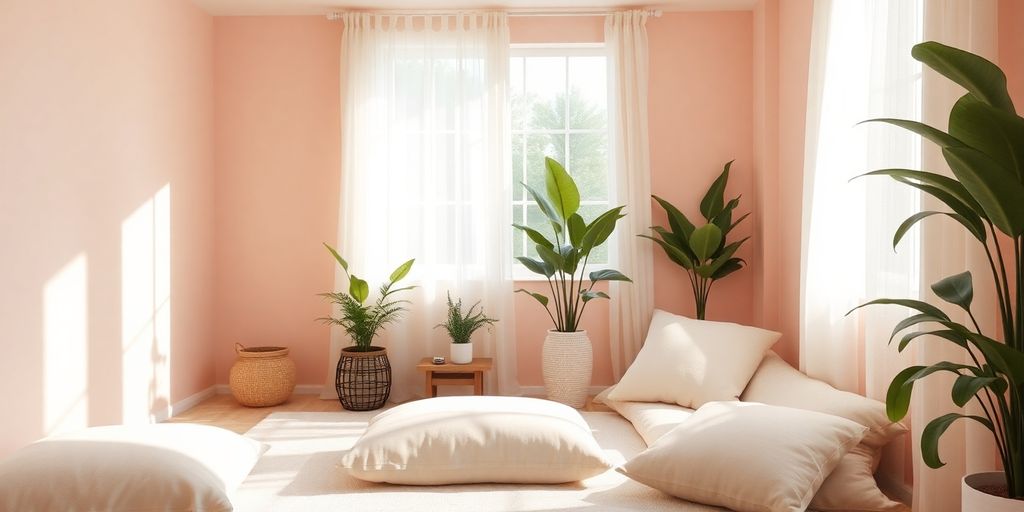
5. Peachy Pink
Peachy pink is a delightful choice for creating a calm atmosphere in your home. This soft hue brings warmth and comfort, making it perfect for spaces where relaxation is key. It pairs beautifully with various decor styles, enhancing the overall aesthetic without overwhelming the senses.
Why Choose Peachy Pink?
- Warmth: This colour adds a gentle warmth to any room.
- Versatility: It complements a range of other colours, from neutrals to bolder shades.
- Soothing Effect: The soft tones promote a sense of peace and tranquillity.
Popular Shades of Peachy Pink
| Shade Name | Brand | Description |
|---|---|---|
| Meet Cute | Clare Paints | A soft, peachy pink that acts as a neutral. |
| Pink Ground | Farrow & Ball | A glowing soft pink with yellow undertones. |
| Bridal Pink | Benjamin Moore | A faded pastel with peach undertones. |
Peachy pink is not just a colour; it’s a feeling. It wraps you in a gentle embrace, making every room feel inviting and serene.
6. Sage Gray
Sage Grey is a wonderful choice for creating a peaceful atmosphere in your home. This soft, muted green-grey hue brings a sense of calm and tranquillity, making it perfect for bedrooms and living spaces. Here are some reasons to consider Sage Grey:
- Versatile: It pairs well with a variety of colours, from warm neutrals to bold accents.
- Nature-inspired: This colour evokes the feeling of being outdoors, reminiscent of serene gardens and lush landscapes.
- Timeless: Sage Grey has a classic appeal that never goes out of style.
Benefits of Sage Grey
| Benefit | Description |
|---|---|
| Calming Atmosphere | Creates a soothing environment for relaxation. |
| Enhances Natural Light | Reflects light beautifully, brightening up spaces. |
| Complements Decor | Works well with both modern and traditional styles. |
Choosing the right paint colour can transform your space into a sanctuary. Sage Grey is a perfect example of how a simple shade can create a serene and inviting home.
7. Lavender
Lavender is a beautiful choice for creating a calm and soothing atmosphere in your home. This gentle hue can transform any space into a peaceful retreat. Here are some reasons why lavender is a great option:
- Versatile: Lavender pairs well with various colours, making it easy to incorporate into your existing decor.
- Mood Enhancer: This colour is known to promote relaxation and reduce stress, perfect for bedrooms or reading nooks.
- Natural Feel: Lavender evokes the beauty of nature, bringing a touch of the outdoors inside.
Tips for Using Lavender in Your Home
- Accent Walls: Consider painting one wall in lavender to create a focal point without overwhelming the room.
- Complementary Decor: Use soft whites or light greys for furniture and accessories to enhance the calming effect.
- Layer Textures: Incorporate different materials like soft fabrics and natural woods to add depth to the lavender theme.
Lavender is not just a colour; it’s a feeling. It can make your home feel more inviting and serene, encouraging relaxation after a long day.
In summary, lavender is a fantastic choice for anyone looking to create a tranquil environment. Its soft tones and versatility make it suitable for various spaces, ensuring your home remains a peaceful haven.
8. Dusty Mauve
Dusty mauve is a beautiful blend of grey and violet, creating a soothing atmosphere in any room. This colour is perfect for those looking to add a touch of elegance without overwhelming the space. Here are some reasons to consider dusty mauve for your home:
- Versatile: Works well in various rooms, from bedrooms to dining areas.
- Calming Effect: Its soft tones promote relaxation and peace.
- Pairs Well: Complements a range of colours, making it easy to match with furniture and decor.
Why Choose Dusty Mauve?
Dusty mauve is not too bold, yet it adds a unique charm to your home. It can transform a simple room into a serene retreat. Here’s a quick overview of its benefits:
| Feature | Description |
|---|---|
| Tone | Soft grey with violet undertones |
| Mood | Creates a calming environment |
| Style | Elegant and sophisticated |
Dusty mauve is a great choice for anyone wanting to create a relaxing space. Its subtlety makes it a favourite among designers, especially in rental properties where neutral tones are preferred.
In summary, dusty mauve is a fantastic option for those seeking a calm and relaxing home environment. Its gentle hue can make any space feel more inviting and peaceful.
9. Icy Blue
Icy Blue is a refreshing shade that brings a sense of calm to any room. This soft blue hue is reminiscent of a clear sky, making it perfect for creating a serene atmosphere in your home. Here are some reasons why Icy Blue is a great choice:
- Promotes relaxation: The cool tones of Icy Blue can help reduce stress and create a peaceful environment.
- Versatile: It pairs well with various colours, including whites, greys, and even warmer tones, making it suitable for any room.
- Brightens spaces: This shade can make a room feel larger and more open, enhancing natural light.
Complementary Colours
| Colour | Description |
|---|---|
| Soft White | A clean, crisp contrast to Icy Blue. |
| Light Grey | Adds depth while maintaining calmness. |
| Warm Beige | Introduces warmth without overpowering. |
Icy Blue is not just a colour; it’s a feeling of tranquillity that can transform your living space into a peaceful retreat.
In conclusion, if you’re looking to create a calming atmosphere in your home, consider using Icy Blue. It’s a colour that not only looks beautiful but also feels refreshing and serene.
10. Emerald Green

Emerald green is a deep, jewel-toned colour that brings a sense of calm and connection to nature. This rich shade can transform any room into a serene oasis, reminiscent of lush forests and tranquil parks. Here are some reasons to consider this colour for your home:
- Nature-Inspired: Emerald green evokes feelings of being outdoors, making it perfect for creating a relaxing atmosphere.
- Versatile: It pairs beautifully with various decor styles, from modern to traditional.
- Mood Enhancer: This colour can uplift your spirits and promote relaxation, making it ideal for bedrooms or living spaces.
Tips for Using Emerald Green
- Accent Walls: Consider painting one wall in emerald green to create a striking focal point.
- Complementary Decor: Use neutral furnishings to balance the boldness of the colour.
- Natural Elements: Incorporate plants or wooden accents to enhance the natural vibe.
Emerald green is not just a colour; it’s a way to bring the beauty of nature indoors, creating a peaceful retreat in your home.
In summary, emerald green is a fantastic choice for anyone looking to create a calm and relaxing environment. Its rich tones and natural associations make it a timeless option for any space.
Final Thoughts on Calming Paint Colours
In conclusion, choosing the right paint colours can greatly enhance the calmness of your home. Soft shades like pale blues, gentle greens, and warm neutrals create a peaceful atmosphere that helps you relax. Whether you’re painting a bedroom, living room, or even a kitchen, these colours can transform your space into a soothing retreat. Remember, it’s important to pick shades that resonate with you personally, as your home should reflect your style while promoting a sense of tranquillity. So, take your time, test different colours, and enjoy the process of creating a serene environment in your home.


Securing the Future: Jayen Consulting Officially Migrates to a New Digital Domain

Focusing on Compliance, Truoux Advances MAS License Application

Truoux Advances UK FCA License Application, Deepens Compliance Strategic Layout

Truoux Optimizes Risk Control and AML Systems, Accelerating the RMO and DAX License Application Process

Rovum Builds Momentum in On-Chain Settlement Markets

Why Small Shipping Boxes Are Becoming the Default for 25-unit Trial Runs

Celeste White’s Influence on Sustainable Agricultural Practices in Napa Valley

FBI Most Wanted: The Hunt for “Fake Heiress” Mary Carole McDonnell

Piet Mondrian x Doodles: Five of Modern Art’s Most Iconic Masterworks Reimagined as Digital Collectibles and Physical Art Prints — For the First Time Ever

CRYMADX Is Trying to Fix What’s Broken in Crypto — And It Might Actually Work

Legal Lines in a Shadowed Space: When People Falsify Death to Dodge Prosecution

Can Padded Envelopes Cut Damage Rates Without Slowing Same-Day Fulfillment?
Kotiuta.com Sets a New Standard for Casino Comparison Transparency in Finland

Scandcoin (SCA) Launches Pioneering Platform, Backing Crypto Assets with Real Scandinavian Startup Equity

The Purr-fect Wave: How TabbyCatMeme ($TCAT) is Redefining the Meme Coin Game on Solana
