Canada News
The Many Emotions of Colors in the Market

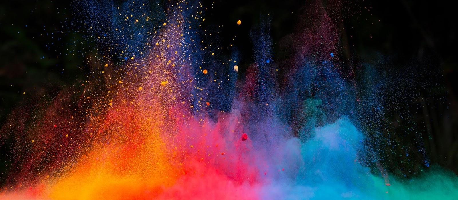
Colors are a vital part of our daily lives, from the clothes we wear to the décor in our homes. While it’s easy to identify basic colors such as red, blue, and green, the range of colors available in the market goes far beyond these primary shades. In this blog, we will explore the vast range of colors available in the market, including the different types of colors, shades, and hues and the many emotions associated with them.
Colors can evoke a wide range of emotions in the market, and different colors can be associated with different emotions. Here are some common emotions tied to colors in the market:
Red: Red is often associated with excitement, passion, and urgency. It can also create a sense of danger or warning.
Blue: Blue is often associated with trust, security, and stability. It can also create a feeling of calmness and relaxation.
Green: Green is often associated with nature, health, and growth. It can also create a feeling of prosperity and wealth.
Yellow: Yellow is often associated with happiness, optimism, and energy. It can also create a feeling of caution or warning.
Purple: Purple is often associated with luxury, royalty, and creativity. It can also create a feeling of mystery and spirituality.
Orange: Orange is often associated with warmth, enthusiasm, and excitement. It can also create a feeling of caution or warning.
Black: Black is often associated with sophistication, power, and elegance. It can also create a feeling of mourning or negativity.
White: White is often associated with purity, cleanliness, and simplicity. It can also create a feeling of emptiness or sterility.
It’s important to note that these associations can vary by culture, industry, and personal experiences. Additionally, color psychology is a complex field that involves a range of factors, including context, hue, saturation, and brightness. Therefore, it’s important to consider these nuances when using color in marketing and branding.
Check out these hues:
Basic Colors:
The basic colors are the primary colors of the color wheel, which include red, blue, and yellow. These colors can be mixed to create secondary and tertiary colors and are the foundation of all other colors.
Secondary Colors:
Secondary colors are created by mixing two primary colors in equal proportions. The secondary colors include green (made by mixing yellow and blue), orange (made by mixing red and yellow), and purple (made by mixing red and blue).
Tertiary Colors:
One main color and one secondary color are combined to produce tertiary colors. These colors include yellow-green, yellow-orange, red-orange, red-purple, blue-purple, and blue-green.
Warm Colors:
Warm colors include red, orange, and yellow. These colors evoke a feeling of warmth, excitement, and energy. They are perfect for creating a lively and vibrant atmosphere.
Cool Colors:
Cool colors include blue, green, and purple. These colors evoke a feeling of calmness, serenity, and relaxation. They are perfect for creating a soothing and peaceful atmosphere.
Neutrals:
Neutrals include white, black, gray, and beige. These colors are versatile and can be paired with any other color. They are perfect for creating a classic and elegant look.
Pastels:
Pastels are soft, light colors that include shades of pink, blue, green, and yellow. These colors create a gentle and soothing atmosphere and are often used in baby rooms and weddings.
Metallic Colors:
Metallic colors include gold, silver, and bronze. These colors add a touch of glamor and sophistication to any space.
Fluorescent Colors:
Fluorescent colors are bright and bold colors that include shades of pink, green, yellow, and orange. They are often used in advertising and fashion to create a bold and eye-catching look.
Check out this color brand to celebrate kid brilliance!
Bellen’s More than Peach Project created a revolutionizing and innovative art brand of “many beautiful colors” to celebrate kid brilliance and to “really, actually” grow spaces. Bellen features resources and tools for educators, parents, and students to learn about and engage in conversations around these important topics. Bellen has recognized the need for more inclusive and diverse education practices in the United States. She offers a variety of resources, including lesson plans, activities, videos, and articles, to help promote inclusive and diverse learning environments. Her website aims to empower educators and parents to create inclusive classrooms and homes that celebrate diversity and promote equity and social justice.
In conclusion, the range of colors available in the market goes far beyond the basic colors. With so many different color options available, you can create any atmosphere or look you desire. So, the next time you’re looking for a color, think beyond peach and explore the vast range of color options available in the market. Whether you’re looking for a warm and energetic vibe or a cool and calm atmosphere, there is a color that will perfectly suit your needs.
What will your next color discovery be for your next project?
-

 Foreign Policy7 days ago
Inside Schedule F: Will Trump’s Federal Workforce Shake-Up Undermine Democracy?
-

 Press Release6 days ago
In2space Launches Campaign to Make Space Travel Accessible for All
-

 Press Release2 days ago
Nura Labs Files Revolutionary Patent: AI-Powered Wallet Solves the $180 Billion Crypto Staking Complexity Crisis
-

 Press Release54 minutes ago
Global Compound Feeds and Additives Industry Report: Market Expansion and Competitive Insights to 2035
-

 Technology14 minutes ago
What to Know Before Switching Cell Phone Network Services in 2025


