Business
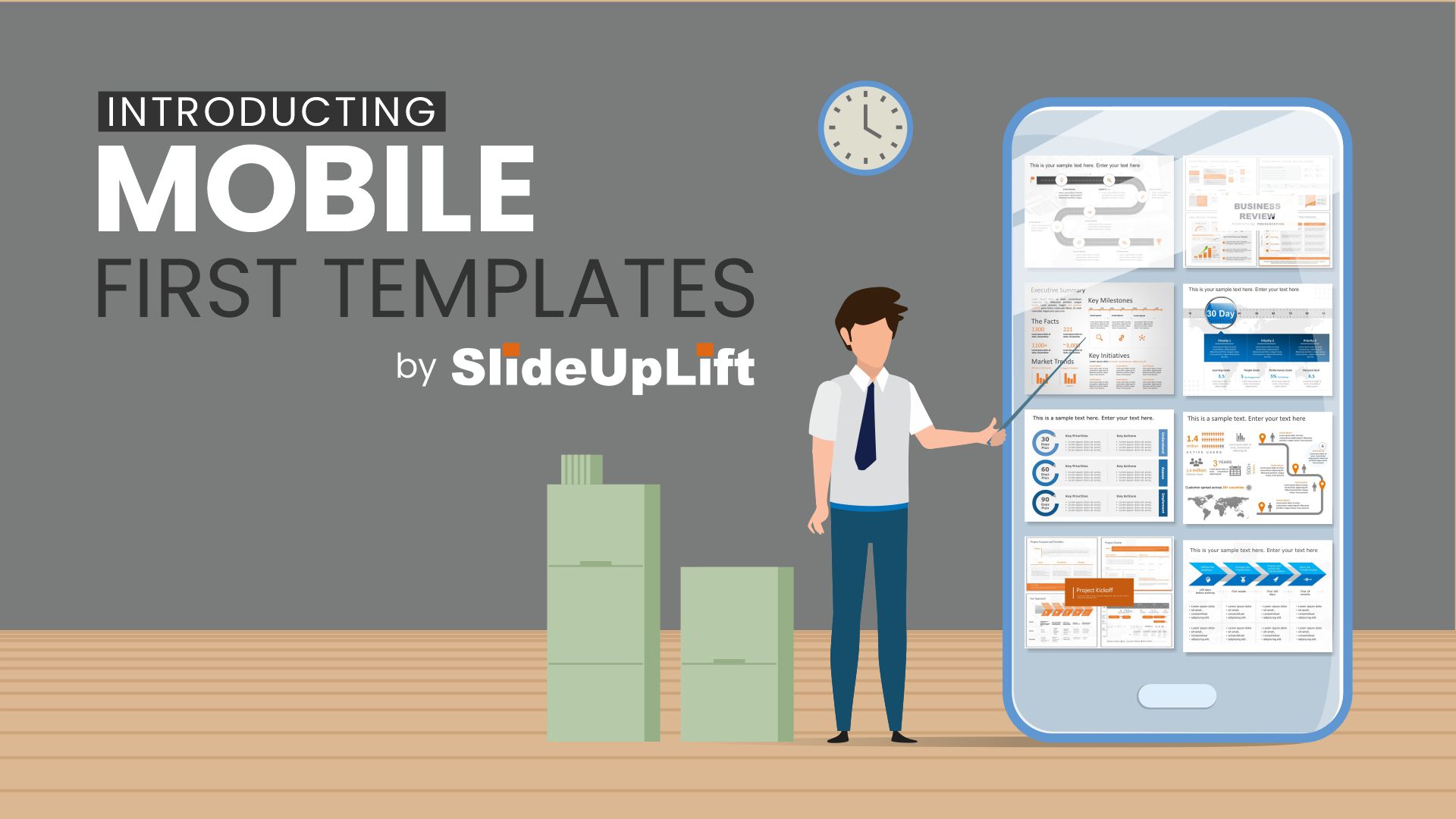
Introducing Mobile First Templates by SlideUpLift
Not all content that gets created is mobile optimized. This is especially true for PowerPoint presentations. SlideUpLift has launched mobile-first templates to ensure that all your presentations give the intended effect when viewed on mobile devices.

With rapidly increasing computing power and features in mobiles and tablets, people are finding mobile devices as their go-to devices for almost everything. From a work standpoint, mobile devices are not just for “on the go” busy professionals – the pandemic-driven work from home models saw mobile usage increase across the board.
Indeed the always-on connectivity, feature-rich apps, and the use-anywhere convenience of mobile just keep people getting more and more hooked on to their favorite devices – be it mobile, tablets, phablets, or what have you.
The challenge: Not all content that gets created is mobile optimized. This is especially true for PowerPoint presentations. Users often experience distorted graphics, see strange font sizes, overlapping text amongst other issues with the content. Sometimes, when opening the presentation on mobile, users just see a blank screen- not knowing that the cause of that is often the size of the file was too big to load.
This, needless to say, is unfortunate given the time and effort the creators spend making the presentations. Sophisticated users, over time, have learned to send pdfs of the documents along with the PowerPoint files to avoid these situations- but that adds yet another item to worry especially in high-stakes presentations situations!
Why does this happen?
The mobile format is different, optimized for a small screen. When one creates PowerPoint content on a large screen, it works well when viewed on large screens. When viewed on small screens like phones or tablets, the mobile devices squeeze content for smaller screens and end up distorting the graphics. Over time, devices have become smarter to still show the content with some reasonableness but the issues are obvious and glaring
The Solution:
Mobile-first templates by SlideUpLift: We keep mobile front and center when creating templates – all templates are thoroughly tested to ensure they look as good and give the intended effect when viewed on mobile devices. This includes file sizes, images, shapes, fonts, use of colors. Yet all this is accomplished without compromising on the high resolution, high definition premium experience for all users- desktop or mobile. Users can pick from fresh designs on thousands of topics – all built grounds up with the mobile experience in mind.
This ensures peace of mind for the presenters that no matter how their content is consumed, the users will get the optimal experience they intended when creating the presentation.
This is yet another example of how the company thinks deeply about how presentation content is created and consumed by its users.
About SlideUpLift:
SlideUpLift is in the business of helping presenters create a high impact on the audience. The SlideUpLift team works tirelessly to help you tell your story using the principles of vision science and storytelling.
We equip professionals with a well-designed repository of pre-designed presentation decks, themes, and templates by their side as a resource to help them in their presentation efforts. These topics vary from Executive Summary, Customer Journey to 30 60 90 Day Plans, and any other business agenda you can think of. The SlideUpLift Library holds a highly curated and ever-growing collection of more than 30000+ PowerPoint and Google Slides Templates, Animations, Charts, Icons, and many other tools to help you create visually engaging and impactful business presentations from anywhere, using any device, on the go. In addition to the vast variety, each template is also 100% editable allowing you to further customize your presentation to your needs.
-

 Press Release4 days ago
Clinical Trials Market Set for Robust Growth, Driven by Drug Development Surge and Digital Innovation
-

 Press Release7 days ago
Bellarium ($BEL) Price Prediction: Could It Hit $5 by 2026?
-

 Business6 days ago
How Managed IT Solutions Help Small Teams Compete at Enterprise Scale
-

 Press Release5 days ago
Industrial Boiler Market Expected to Surpass USD 24.4 Billion by 2035 Amid Growing Demand for Energy Efficiency and Industrialization
-

 Press Release5 days ago
Green Bio Chemicals Market Poised for Sustainable Growth amidst Global Shift to Eco-Friendly Alternatives by 2035
-

 Press Release5 days ago
Fill-Finish Pharmaceutical Contract Manufacturing Market Expected to Flourish Amid Biopharmaceutical Boom and Global Outsourcing Trend by 2035
-

 Press Release5 days ago
Preventive Vaccines Market to Witness Strong Growth by 2035
-

 Press Release5 days ago
Pet Food Nutraceutical Market Set for Robust Expansion Amid Rising Demand for Pet Wellness by 2035


